How to design your own shirt when you can't draw
Guides · 26 August 2026 · 7 min read
Seven steps from “I have an idea” to a shirt you'd actually wear — including the words that do the heavy lifting, and the ones that quietly ruin the print.
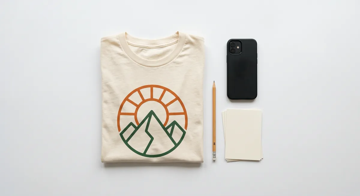
Almost everyone has had the thought. You see a shirt in a shop and it's almost right — wrong colour, wrong joke, wrong decade — and somewhere behind your eyes sits the version that would actually be right. Then you check the price of a designer, or open a design tool with 400 buttons in it, and the idea quietly dies of embarrassment.
It doesn't have to. Designing your own shirt is no longer a drawing problem — it's a describing problem. And describing things is a skill you've been practising your whole life.
The mindset shift
Old way: have an idea, learn Illustrator, spend six weekends on it, produce something that looks like it took six weekends. New way: say the idea out loud, get four versions in seconds, and your job becomes choosing and steering rather than drawing.
That's a different skill, and it's a real one. You're not the illustrator now — you're the art director. Art directors don't draw. They look at something and say “bigger, angrier, and lose the hat.” You can absolutely do that.
The bottleneck was never your hands. It was the distance between your idea and something you could look at.
The anatomy of a prompt that works
A weak prompt is one word: “dragon.” A strong one answers a few of these without turning into homework. Treat them as dials, not rules:
- Subject — “a dragon” is a start. “A sleeping dragon curled around a lighthouse” is a design.
- Style — “vintage woodblock print,” “1970s sci-fi paperback,” “chunky sticker art,” “fine ink linework.” This one word does more work than any other.
- Composition — “centred badge,” “tall vertical crest,” “wide banner across the chest,” “small pocket-size mark.”
- Mood and palette — “moody and muted,” “sun-bleached,” “high contrast black and white,” “three colours only.”
- Detail level — “simple and bold” prints beautifully. “Intricate, hyper-detailed” looks incredible on your phone and turns to soup at nine inches wide on cotton.
Two good dials beat five vague ones. “A sleeping dragon curled around a lighthouse, vintage woodblock print, muted” is already a better brief than most agencies get.

Adjectives are free. Use them like you're not paying for them, because you aren't. The llama has never once been charged extra for the word “moody.”
Seven steps from “I have an idea” to a shirt
- Say the idea in one plain sentenceNo jargon, no design vocabulary. If you can text it to a friend, it's a good prompt. Start with the thing itself, not the styling.
- Add one style wordJust one, on the first pass. Style changes everything downstream, so see what it does alone before stacking more on top.
- Look at all the takes before judging any of themYou'll get several directions at once. Resist grabbing the first. Ask what each one got right — that answer is usually your next instruction.
- Steer one change at a time“Bolder.” “Lose the background.” “Same one, facing left.” Change five things at once and you learn nothing when it goes sideways.
- Decide light shirt or dark shirt nowThis changes the art, not just the mockup. Dark linework disappears on a black tee; soft glowing edges die on white. Pick the garment, then tune the design for it.
- Simplify once, deliberatelyAsk for a version with less in it — fewer elements, fewer colours, more empty space. Nine times out of ten the simpler one is the shirt you'd actually wear out of the house.
- Check it smallShrink the preview to thumbnail size and squint. That's how it reads from across a room, which is where every shirt is seen. If it turns into a smudge, it's too detailed.
The words that quietly ruin a print
Some instructions sound sophisticated on screen and cause real trouble on fabric — not because the design is bad, but because a printer is a physical object with opinions.
- “Photorealistic” on apparel. A photo printed on cotton looks like a photo printed on cotton. Illustration and painted styles hold up far better.
- “Soft gradient fading to white” on a white shirt. The faded end has nowhere to go — it just becomes the shirt, usually with a visible edge where the print stops.
- “Tiny intricate details everywhere.” Detail below about a millimetre on the final print is a rumour, not a detail.
- “Neon” and “fluorescent.” Screens emit light; ink doesn't. They'll print calmer than the preview promised.
None of these are forbidden. They're just things to choose on purpose rather than stumble into.
Text on a shirt is its own sport
If your idea is a phrase, treat the words as the design rather than something sitting on top of it. Short beats clever — three to five words is the readable range from a normal conversational distance. Longer becomes a paragraph people have to approach you to read, and nobody wants to be approached for that reason.
And check every letter. AI lettering is dramatically better than it was, and still worth reading character by character before you commit — especially unusual names, numbers, or a language the model sees less often. Fifteen seconds of proofreading against something you'll own for years.
Every shirt with a typo in it is technically one of a kind. This is not the kind of one-of-a-kind we're going for, and the llama will say so during quality control.
Pick the blank before you finish the design
The garment is half the design and gets about five percent of the attention. Quick orientation:
- White or light tees — the widest range. Almost anything works; the fabric supplies the bright areas for free.
- Black and dark tees — designs pop hard, but anything dark inside the artwork vanishes. Aim for bright or mid-tone art with real contrast.
- Hoodies and sweatshirts — heavier fabric, more texture, and seams eat placement space. Bold, chunky art beats fine linework.
- Caps — a small, curved area on a stiff surface. Simple marks only; a detailed scene won't survive the geometry.
- Mugs, totes, posters, phone cases — different shapes, different rules. A tall poster design needs recomposing for a wide mug wrap.
The principle: design for the surface, not for the screenshot.
What “print-ready” actually means
Resolution is pixels, not the number in the file's metadata. Print resolution is the file's pixel width divided by how many inches it's printed across. A front-of-tee placement runs roughly 9 to 12 inches wide and 150 DPI is the usual floor for apparel — so you want a file in the low thousands of pixels before it's stretched across a chest. Phone cases want closer to 300, because the print is small and held near your face.
The background has to be gone. Not white — gone. A design saved with a white background looks fine on a white shirt and shows up as a pale rectangle on a navy one. Doing that removal badly leaves a fringe of leftover pixels around every edge that prints as a halo.
Contrast against the garment does the work. If the darkest part of the design and the shirt are close in tone, it'll look muddy no matter how good the file is.
How to know when it's done
- Does it read from three metres away, or turn into texture?
- Would you wear it somewhere other than your own house?
- Is it still recognisable at postage-stamp size?
- Is there anything you'd have to explain? (Fine — as long as you want to have that conversation regularly.)
And the honest one: the difference between version four and version eleven is usually not quality. It's nerves. Somewhere around take six, most people stop improving the design and start hiding from the decision.
Inka is the short version of everything above: describe the idea in a chat, an AI designer sketches it several ways in seconds, and you steer it until it's yours. A human checks the print quality before anything goes near a printer, and it's made to order and shipped from the facility nearest you. No design skills, no account, no minimum order.
Start designingKeep reading
Explainers · 6 min read
AI print-on-demand, explained without the buzzwords
What POD is, what the AI genuinely does, and the six things that happen to your design after you order — including the boring one that decides how it looks.
Read it26 August 2026
Ideas · 6 min read
The future of clothing is one of one
Fast fashion optimised for the average person, who doesn't exist. The case for clothes made once, for one person — and what AI genuinely has to do with it.
Read it26 August 2026